- by Jörn Meyer
- published
Man, in the years and years I’ve been working with David Cummings and his team for the NoSleep podcast, they sure never ceased to amaze me with the amount of exciting and interesting projects they throw my way.
I can say without hyperbole that working for them has been one of the most important steps in my art career.
This week, I was asked to illustrate “The Graduation” by D. Williams. Let me show you the artwork before I tell you why this particular illustration stands out.
![]()
Just a very normal camping trip
For my excitement to make sense, you must first know that the NoSleep Podcast sometimes features ad-reads. Rather than read a boring, boilerplate text, though, they have fun with it. All advertisements are a funny mini-story, firmly anchored in the horror genre, but usually hilarious. Instead of being a jarring interruption in your normal enjoyment of your entertainment, they provide something many fans look forward to.
This week’s sponsor is none other than American Horror Story! The horror anthology is currently producing a new series called American Horror Story 1984 (which is, coincidentally, my birth year) and will thematically give a hat-tip to that era’s slasher flicks and B horror movies.
If you look over the page for NoSleep’s S13E12, you will find that the stories also pay homage to that same theme.
One theme, five illustrators
To celebrate the specialness of this episode, NoSleep commissioned five illustrators from the team to illustrate a story that was featured. All of these illustrations were inserted into a poster design, making them look like VHS tapes (aah, the memories).
Here’s the full spread:
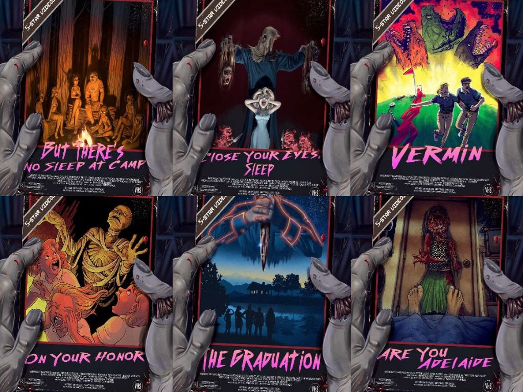
From top left to bottom right:
- “But There’s No Sleep at Camp” by Hasani Walker
- “Close Your Eyes, Sleep” also by Hasani Walker
- “Vermin” by Lukasz Godlewski
- “On Your Honor” by Abby Howard
- “The Graduation” by Yours Truly
- “Are You Adelaide” by Mark Pelham
How I did the illustration
I started my work, as usual, by doing research. This led me down a delightful path of cheesy and sometimes outright kitschy 80s slasher horror posters.
One element that featured in many of the designs was the killer or creature (the “Big Creepy”, as it’s sometimes called in our household) looming menacingly over our protagonists. That, together with the fact that one of the victims in the story describes the killer as having no face, gave me my first idea.
Since the cabin by the lake is the only reason those poor, misguided teenagers are in harm’s way, I also needed to feature it. I chose to depict the scene as harmless and serene, in stark contrast to the bloody knife looming over them.
When the illustration was almost done, I noticed it being a bit monochrome. Thus, the idea of the neon outline was born. It serves three purposes:
- direct the attention of the viewer upwards to the killer
- break up the monotony of the blue hues with some bold colors
- give a delightful throwback to 80s aesthetics
All in all, The Graduation was a fun exploration into a different style, and I am very grateful to NoSleep for the opportunity in taking part in something so cool.
Until next time, my lovelies, stay safe — and maybe don’t make any vacation plans involving remote, quiet lakes.
